
Caire Design System
A living design system built with purpose to deliver simple, accessible, and approachable patterns, designed to scale and evolve with us.
Team
Product Designer (me) &
Head of Front-End Engineering
Tools & Resources
WC3 WCAG Guide, Nelson Norman, Stark, Leondaro Color, Untitled UI, Tailwind, Mantine, Material UI, Spectrum, Mobbin, Figma, FigJam
Problem
With a matter of months to deliver, our team was tasked to create a suite of transformative Gen AI health solutions designed to help provide patients with a more seamless healthcare experience and to reduce administrative burdens on healthcare teams.
Solution
As a designer of one on a small team, the head of front-end engineering and I strategized a plan to develop a style guide, foundational components, and SOPs that would enable us to build pragmatically using simple, intuitive, and scalable patterns.
Impact
By focusing on foundations early on, we were able to develop clear, reusable patterns that would later support us through four distinct product launches, dozens of investor demos, and one company-level pivot.
How can we
develop a foundational design system that enables us to rapidly build and deliver our MLP using simple, intuitive, and scalable patterns?
Planning
Move slow to go fast
I am a firm believer in the phrase “move slow to go fast”. In the context of creating a new product, this phrase meant investing time and resources upfront to thoroughly appreciate the high-level problems we’re aiming to solve. With a design team of one and a front-end developer team of three, we had to be very pragmatic in our execution. To set ourselves up for success, our lead front-end developer and I began working through foundational decisions that would define our product to come. In these conversations, we discussed topics like building for accessibility, developing and democratizing product development SOPs, building vs. buying a component library, the creation and implementation of tokens, and more… Among all these conversations, knew we wouldn’t have all the answers on day one, and that our thinking would evolve with us.

Accessibility
Becoming an a11y
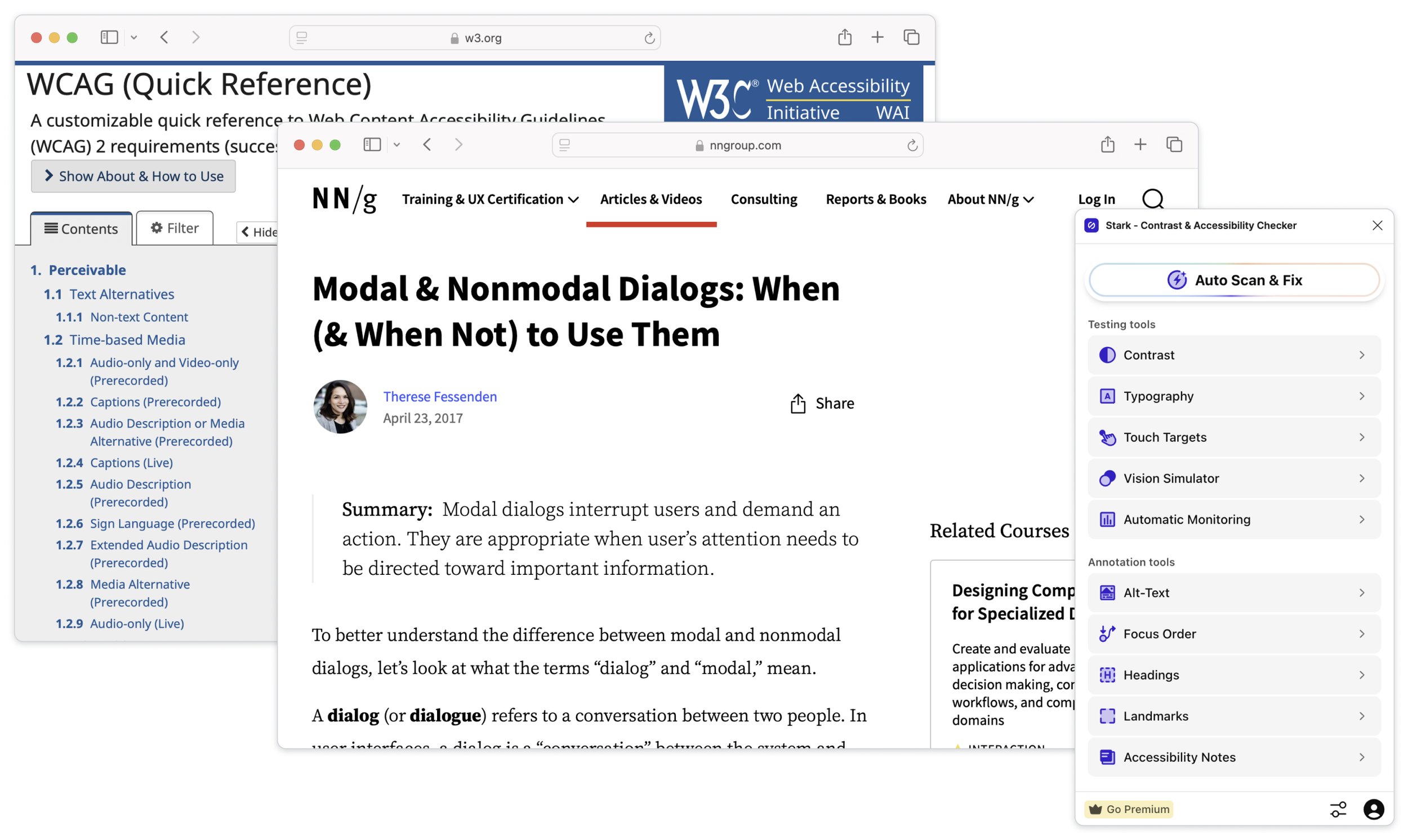
Accessibility isn’t optional. Accessibility isn’t a feature. Accessibility is a requirement. While accessibility standards like WCAG and Section 508 were originally developed to help people with disabilities, the reality is that these standards benefit everyone. Recognizing the importance of building accessible products, our head of frontend engineering and I collaborated from the beginning to integrate foundational accessibility standards into the very core of our design system and code-stack. As part of the process, we developed a scaled APCA color library, calibrated our system typeface to meet WCAG text guidelines, and established a consistent spacing and grid system. From here, we co-developed WCAG-compliant foundational components and drafted accessibility test plans and SOPs.
Color
Color plays a crucial role in a product. Every color carries unique qualities that can (and will) evoke a reaction (voluntary or not) from the user. Furthermore, colors are not created equal. For instance, a bright yellow does not offer the same contrast qualities as a bright blue of the same relative brightness level.
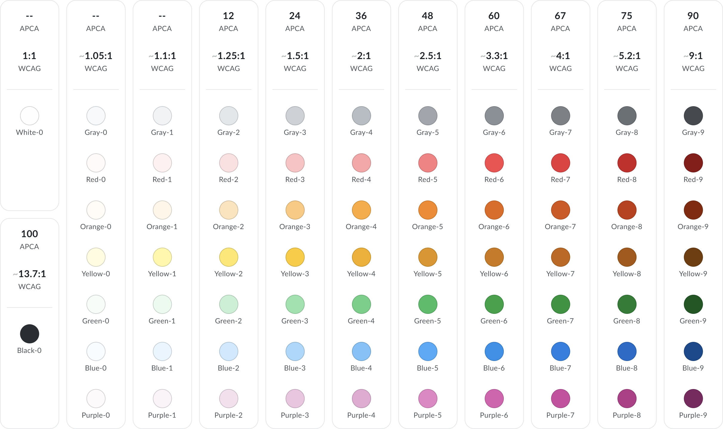
While developing our primitive color swatches, I wanted to create a system that would allow us to switch between hues while maintaining a consistent perceptible contrast. WCAG 2.0 has historically been the standard for evaluating color contrast, however has its flaws as it calculates values uniformly across all hues. The problem: humans don’t perceive colors uniformly across the spectrum. Luckily, a superior standard called APCA has been developed which better accounts for how the human eye actually perceives color.
With our objectives in mind and our knowledge of APCA, we were ready to create a primitive color collection. We began by designing a 10-column layout, each column representing a specific stepped APCA contrast threshold. From there, we hand-selected 7 hues and calibrated them against these contrast thresholds, resulting in a total of 70 colors. We also added pure white and a deeper grey to our collection, making it a total of 72 colors. These color primitives form the foundation to which all system attributes and components map back to using tokens.
Typography
A typeface isn’t just text. It is a decision that carries consequence. Just as with color, a typeface and the characteristics it exhibits have an impact. For instance, a serif typeface like Times, gives a more traditional, newspaper-like feel; whereas a sans serif typeface like Open Sans, is a more modern, neutral choice. The formatting of a selected typeface can be just as impactful as the typeface itself. For example, a typeface with zero kerning and zero leading will sure make an impression, though it will fail to meet accessibility checks.
As a platform serving patients and providers, we wanted to select a typeface that was warm and approachable, but also professional and trustworthy. We also knew from accessibility research that sans serif is the recommended style for digital interfaces. From a technical standpoint, we also wanted a typeface with expansive multi-language support, several weights, and an Open Font License. With a search criteria in mind, we scoured Google Fonts and chose Lato; a warm, sans serif typeface with all the qualifications we could ask for.
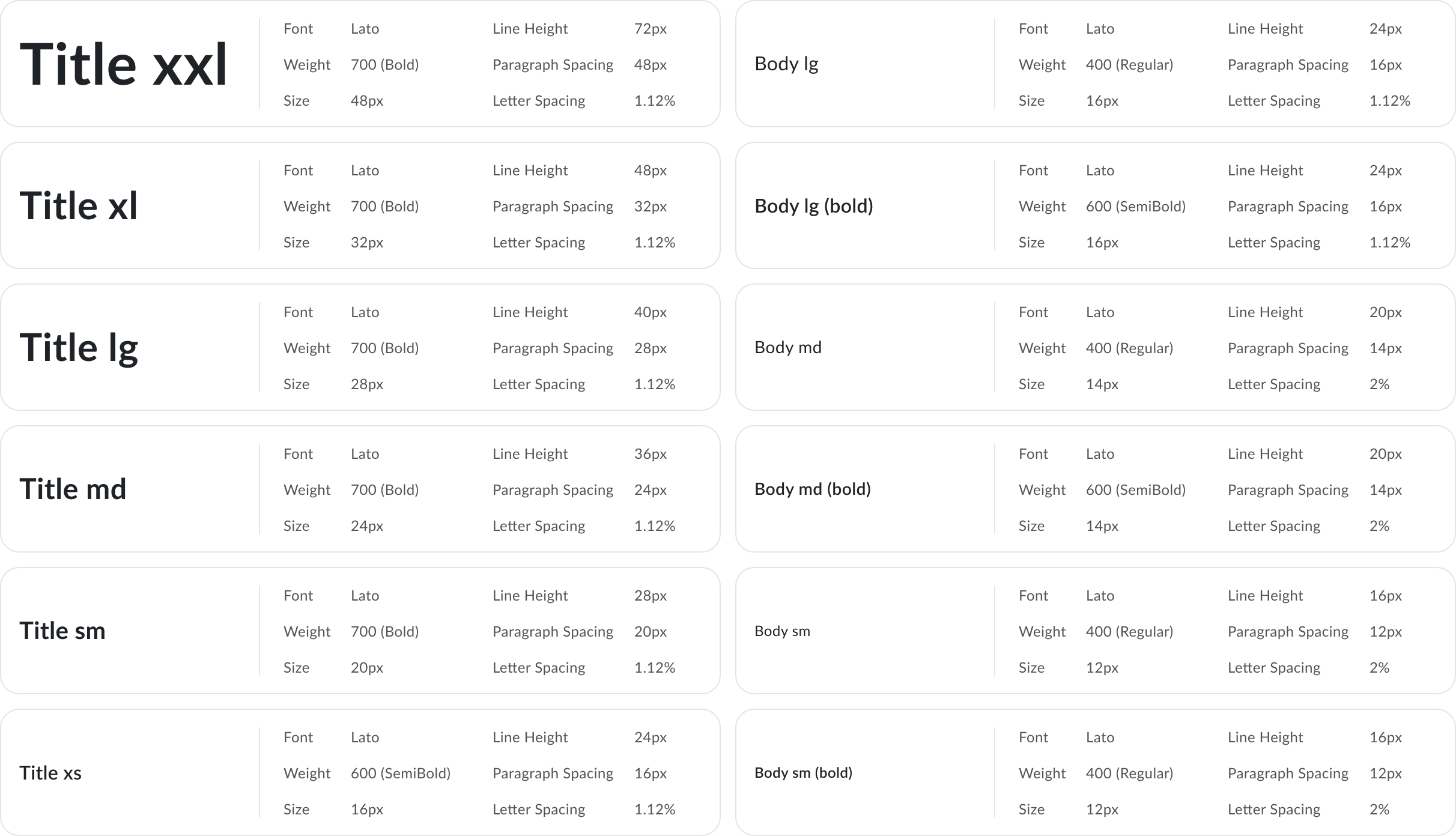
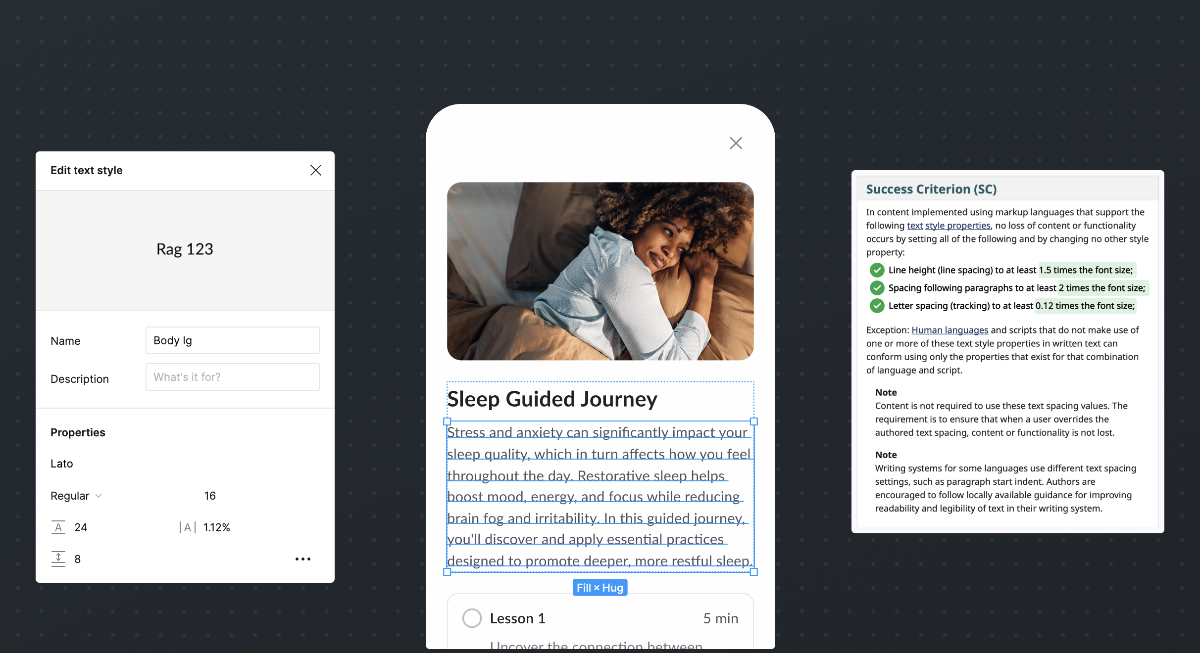
Now that we selected our system typeface, we needed to define a robust typographic scale to serve as our usage guide and text style library. For this process, we heavily leaned on industry patterns and WCAG guidelines to help us define the number of styles, type size, weight, kerning, leading, and tracking values. In the end, we created a text style guide featuring 10 scales (5 for titles and 5 for body text) each carefully calibrated to meet our needs while ensuring compliance with WCAG accessibility guidelines.
Spacing & Grid
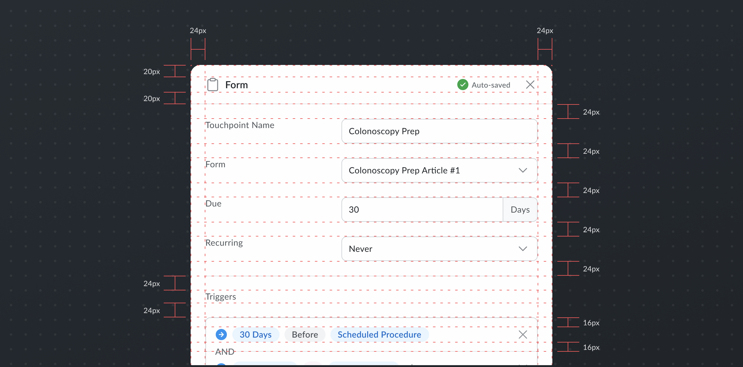
A well-defined spacing and grid system is critical to helping maintain consistency and build for scalability. With it, we can establish key design patterns, such as the standard padding values for modals or the number of columns in our desktop page layout. Without it, we’re left with a mess, and constantly in search of “the source of truth”.
Our aim was develop a versatile spacing system that would promote consistency, without hindering creativity. While choosing our spacing system, we evaluated a slew of different systems. Some were linear and based on units of 8px (8, 16, 24, 32…) while others were power-based (2, 4, 8, 16…). We ultimately aligned on a highly versatile 4px grid system that gives a high degree of flexibility.
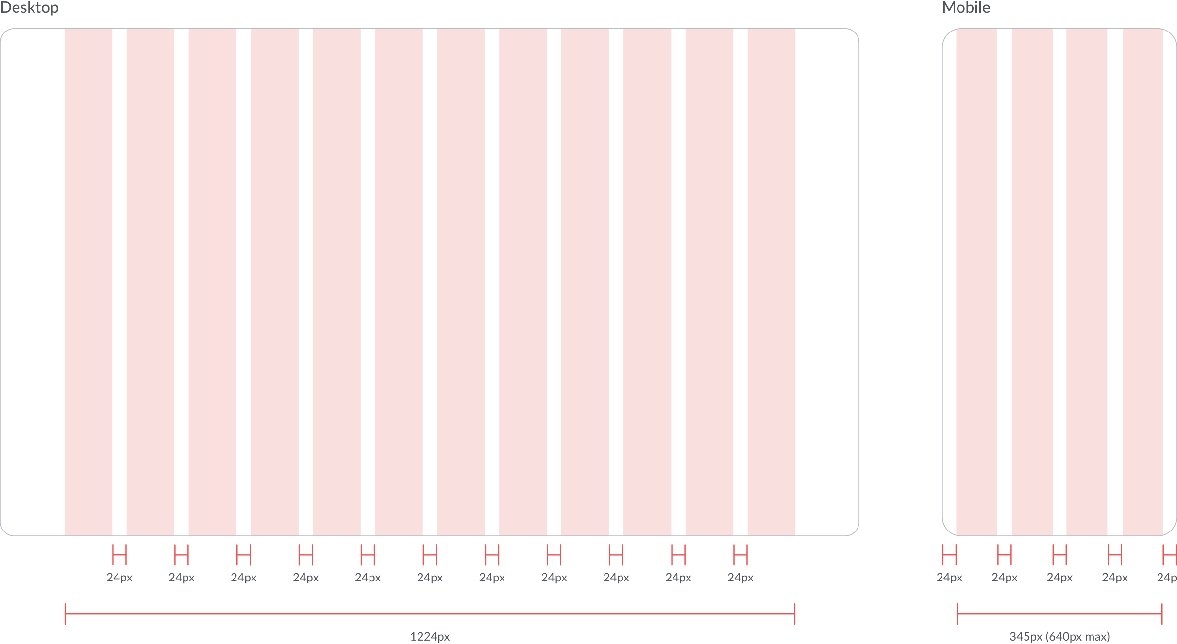
With our 4px grid system in place, we began adding structure to our structure. For our desktop product, we adopted a flexible 12-column layout with 24px margins and a max container width of 1280px. For our mobile product, we implemented a mobile-first 4-column layout with a max width of 640px. While we aimed to optimize each of our products for all viewports, resource constraints required us to prioritize based on each product’s expected usage.

Tokens
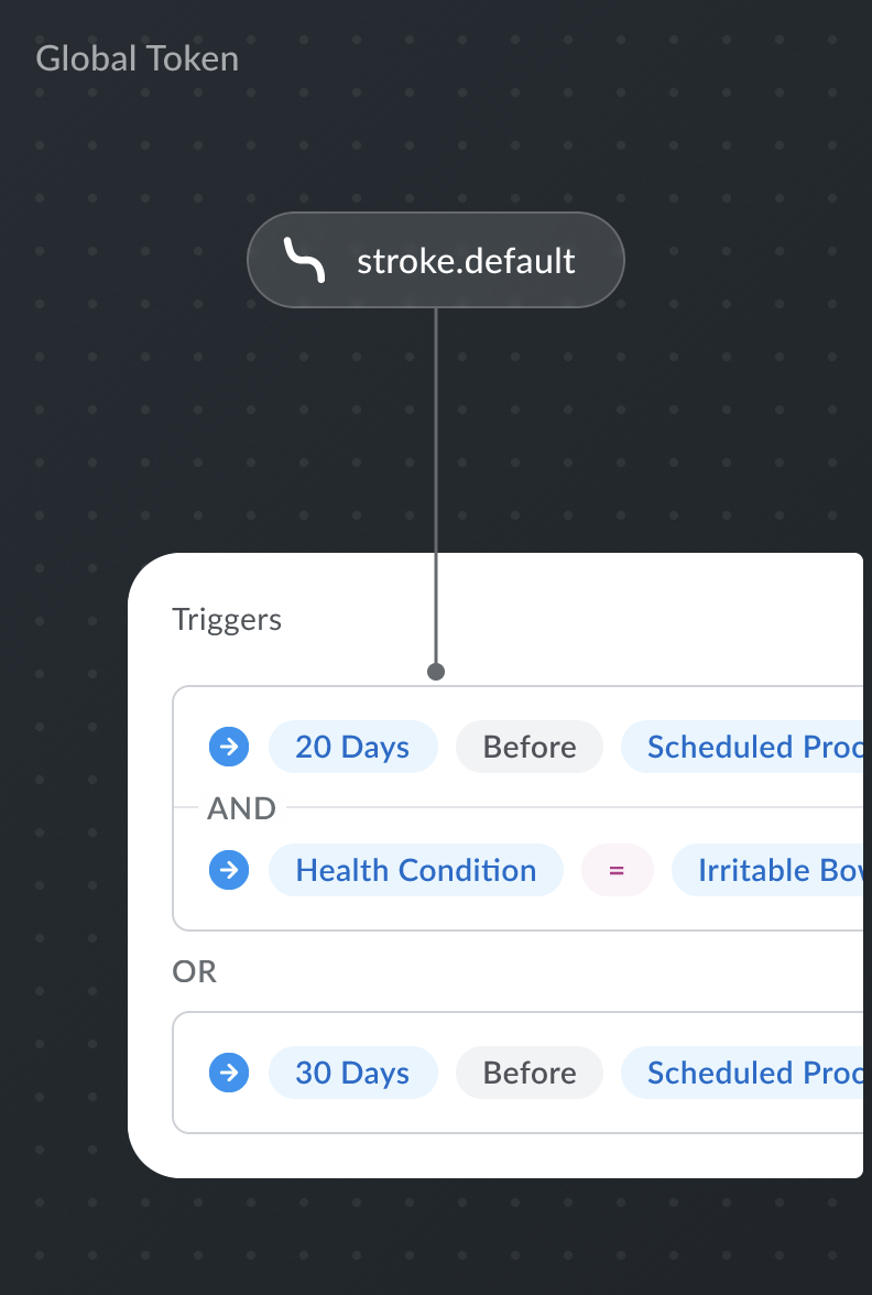
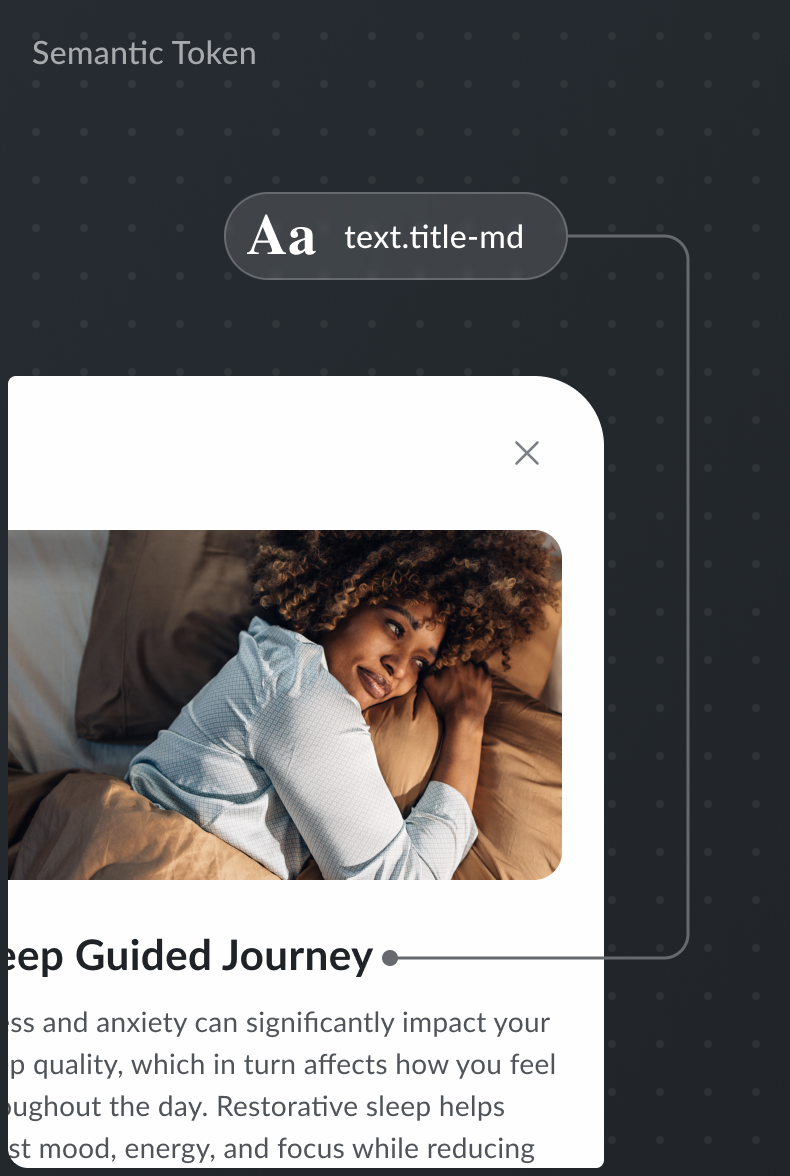
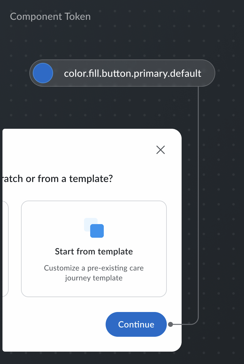
We wanted to develop a systematic means of linking commonly referenced values with recognizable and meaningful aliases, aka design tokens. When defined well, design tokens can truly help designers and engineers collaborate better together. When defined poorly, design tokens can become a menace to maintain and lead to miscommunication of design intent.
Recognizing the potential of design tokens, we aimed to find the “sweet spot” of how specific do we define our tokens. We knew relying solely on primitive tokens wouldn't be effective, as they would merely serve as aliases to their raw foundational values. We also wanted to avoid component tokens, as they could bloat our token library with semantically redundant variables. In the end, we decided to focus on building out global and semantic tokens, which provide sufficient usage context without creating overly-defined tokens (when they are not needed).

Foundational Component Library
Built for purpose
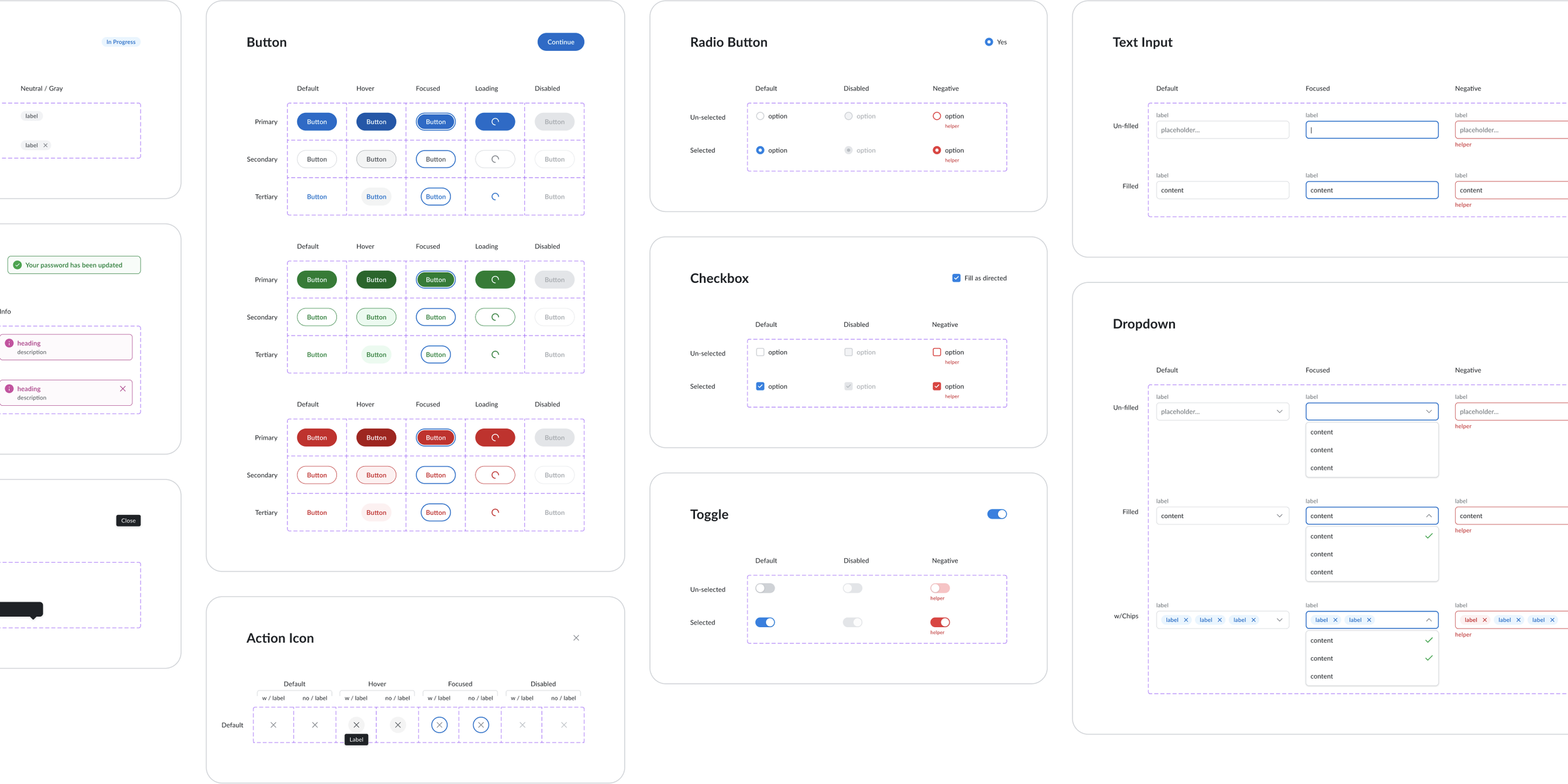
Our philosophy with components was to focus on the intention. What is the action or job that a user needs to perform and how can we help them accomplish it? In pursuit of developing accessible and versatile components, we leveraged best practices from institutions like W3C and Nielsen Norman Group. These resources helped inform us of best practices such as: click target size of a primary button, ARIA text for a certain text input field, and more. We also got inspiration from open-source design system’s like Untitled UI and Tailwind; along with from ionic design systems like Google’s Material UI and Adobe’s Spectrum Design System. Combining our researched usability knowledge with our newly formed foundations and principles, we set out to create a series of components that would serve as a foundation for future components to come.
Reflection
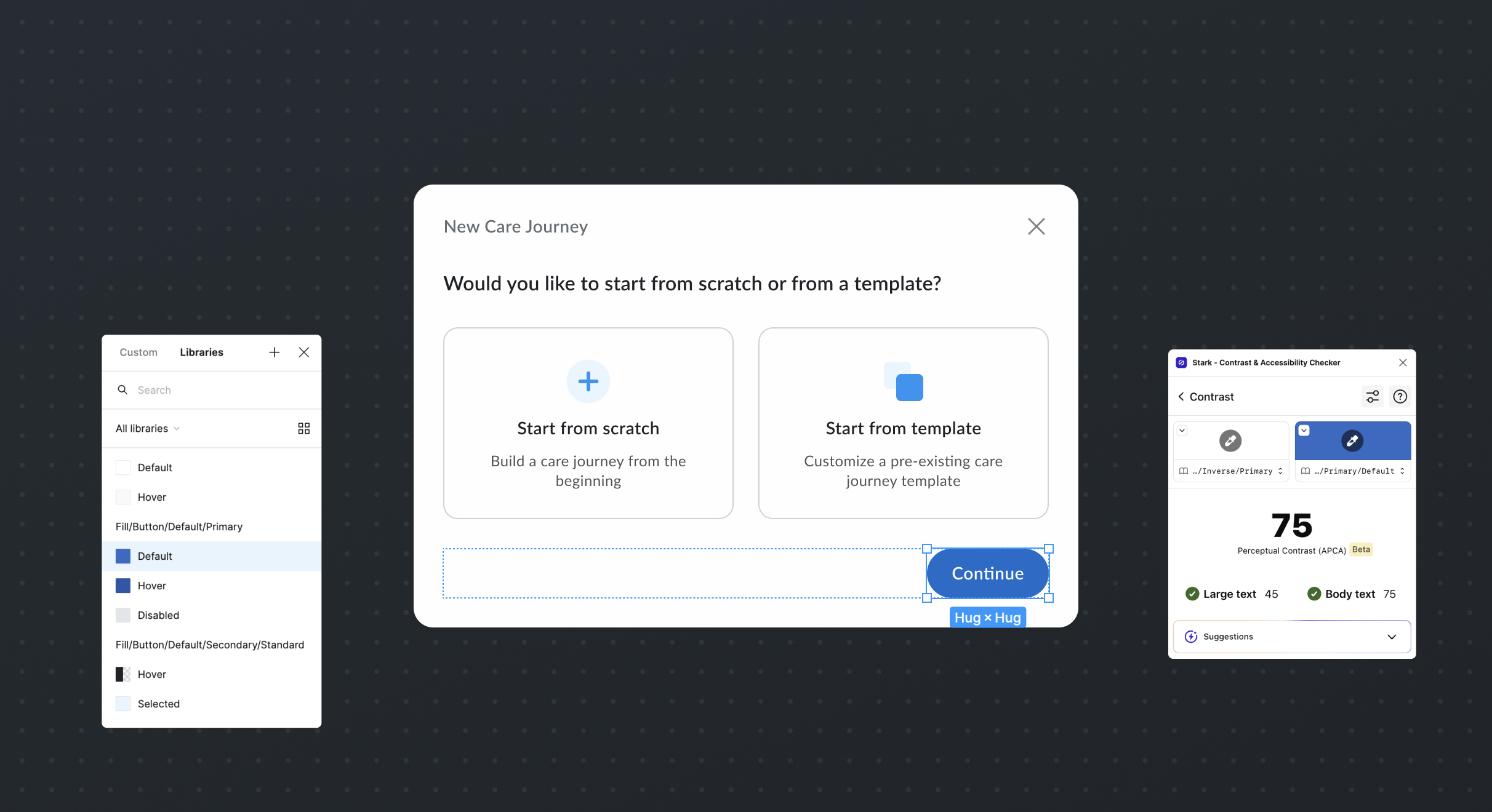
Co-developing a design system from scratch was an enriching and humbling experience. Along the way, we deepened our accessibility knowledge by learning from some of the best institutions like W3C and Nelson Norman Group. We got inspiration from open-source design system’s like Untitled UI and Tailwind, which helped inform our spacing and grid frameworks; and from iconic system’s like Google’s Material UI and Adobe’s Spectrum Design System, which helped inform our token framework. We implemented Stark (an accessibility audit Figma and developer plugin) into our process, which helped us audit and adherence with WCAG standards as we designed and developed our workflows. Collectively, our living design system enabled us to optimize our limited resources, and deliver four distinct products, dozens of investor demos, and us navigate through a company-level pivot.